150+ Flyer Design Ideas That Turn Promotions Into Long-Term Brand Assets
Most flyers fail for one simple reason.
They are designed to sell once, not to build a brand.
A flyer rushed out for a weekend sale or quick announcement might generate short-term attention, but once the offer expires, the flyer becomes irrelevant. It gets tossed, ignored, or forgotten.
Smart businesses approach flyers differently.
They treat every flyer as a brand touchpoint — a physical extension of their storefront, website, and reputation. When done right, a flyer doesn’t just promote an offer. It builds familiarity, trust, and recognition that compounds over time.
At The Complete Package, we see flyers perform best when they balance clear messaging, strong visual hierarchy, and consistent branding. That’s what turns one-time promotions into long-term marketing assets.
This guide breaks down:
Why branding-focused flyers outperform discount-driven designs
Industry-specific flyer design ideas that actually work
Practical flyer design tips that go beyond “limited time offers”
How professionally printed flyers elevate brand perception
Why Branding-Focused Flyers Make Business Sense
Many businesses view flyers as a cost.
Strong brands treat them as an investment.
A well-designed flyer continues working long after it’s handed out or mailed. Even if someone doesn’t act immediately, they remember the colors, layout, typography, and overall professionalism. When they later see your storefront, website, or signage, that familiarity creates trust.
Consistency matters more than most businesses realize.
Brands that use consistent colors, fonts, spacing, and tone across flyers look more established and reliable. Customers subconsciously assume:
If they’re this intentional with design, they’re probably careful with their products and services too.
Another advantage?
Brand-led flyers reduce dependence on heavy discounts. When your brand looks credible and polished, you don’t need to compete on price alone to earn attention.
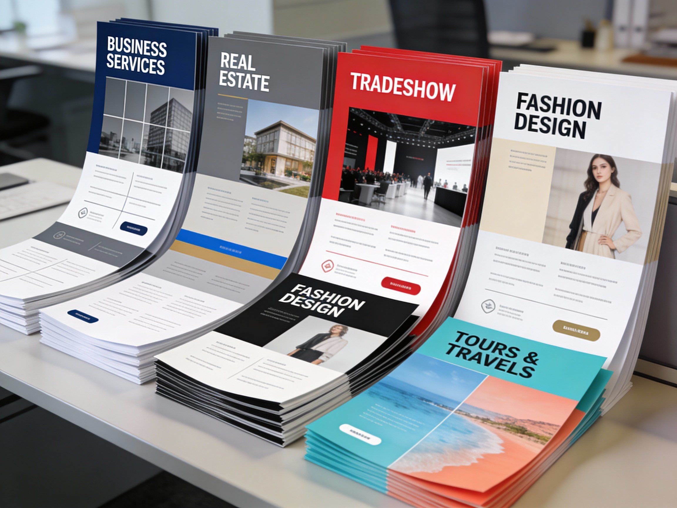
Flyer Design Ideas by Industry (What Actually Works)
Different industries use flyers for different reasons. A layout that works for real estate will fail for education. A party flyer style would damage a corporate brand.
Here’s how flyer design should adapt by industry when branding is the priority.
1. Corporate Flyers
Corporate flyers should feel composed and confident, never flashy. Clean layouts, restrained color palettes, and professional typography work best.
Ideal for:
Conferences
Internal announcements
Corporate events
Company updates
If someone glances at it for two seconds, it should already feel trustworthy.
2. Communication & Informational Flyers
Clarity is everything here. Strong headlines, structured sections, icons for navigation, and generous white space improve readability.
These flyers are often used for:
Policy updates
Service instructions
Community announcements
The message should be understood instantly.
3. Travel & Tourism Flyers
Emotion comes first. Strong imagery, open layouts, and inviting colors matter more than pricing details upfront.
The goal is simple:
Make the reader imagine themselves already there.
4. Education & Academic Flyers
Overdesign hurts credibility in education. Calm colors, readable fonts, and structured layouts signal seriousness and reliability.
Perfect for:
School admissions
Training programs
Workshops and seminars
Sales-heavy visuals should be avoided.
5. Agriculture Flyers
Authenticity matters more than polish. Earthy tones, practical visuals, and straightforward language perform best.
These flyers are often read carefully, shared, and kept — not skimmed and discarded.
6. Startup Flyers
Startups need clarity fast. Bold headlines, simple visuals, and a clear value proposition are critical.
If someone can’t understand what the business does within five seconds, the flyer fails.
7. Automobile Flyers
Let the product lead. High-quality vehicle images, strong contrast, and focused layouts work best.
Avoid clutter. Highlight design, performance, or key features.
8. Company Update Flyers
Consistency is key. These flyers should look unmistakably like your brand.
Simple, clean, and recognizable layouts reinforce credibility.
9. Party & Event Flyers
Energy is welcome — chaos is not. Colors, typography, and layout should match the event vibe while staying readable.
Good party flyers feel intentional, not messy.
10. Entertainment Flyers
Curiosity drives engagement. Strong visuals, dramatic composition, and mood-setting design matter more than dense text.
Details can come later.
11. Fashion Flyers
Fashion flyers sell taste, not just products. Whether minimal or experimental, the design must align with the brand’s identity.
When done right, even simple designs feel premium.
12. Festival & Seasonal Offer Flyers
Festive cues should enhance the brand, not overpower it. Smart designs balance celebration with brand consistency.
The goal is recall beyond the season.
13. Engineering Flyers
Clarity beats creativity. Clean grids, technical visuals, and structured information build confidence.
Flashy designs often reduce trust in technical industries.
14. Business & Office Flyers
Answer one question immediately:
Why should I care?
Clear benefits, direct messaging, and no unnecessary decoration.
15. Real Estate Flyers
Spacious layouts, high-quality property images, and elegant typography work best.
The flyer should mirror the experience being sold: open, refined, and professional.
16. Beauty & Healthcare Flyers
Soft colors, clean visuals, and calm layouts build trust.
Whether for clinics, salons, or wellness brands, the flyer should feel reassuring and premium.
17. Hospitality Flyers
Focus on comfort and experience. Warm colors, inviting photography, and relaxed layouts outperform aggressive sales messaging.
18. Digital Flyers
If it doesn’t read clearly on a phone screen, it doesn’t work.
Strong contrast, simple layouts, and concise messaging are essential.
Flyer Design Tips That Go Beyond “Limited Time Offers”
Start With Brand Thinking
Design shouldn’t begin with “Where do we place the offer?”
It should start with:
What should this flyer make people feel?
Trust, excitement, premium quality, or simplicity — once that’s defined, design decisions become easier and more consistent.
Consistency Builds Recognition
Using the same color palette, typography, and visual style across flyers isn’t boring. It’s powerful.
Familiarity creates comfort. Comfort drives action.
Design for Quick Scanning
Most people give flyers 3–5 seconds.
Your design must instantly answer:
Who is this for?
What is it about?
Why does it matter?
Strong hierarchy and spacing are non-negotiable.
One Core Message Wins
Trying to communicate multiple offers weakens impact.
Strong flyers focus on one clear idea and support it visually.
Typography Sets the Tone
Fonts communicate personality. A mismatch breaks trust instantly.
Typography should always align with your brand voice.
Use Real, Meaningful Visuals
Every image should serve a purpose. Real products, real spaces, and real experiences create stronger connections than generic visuals.
Print Quality Matters
Paper thickness, finish, and print clarity directly affect perceived value.
A premium brand on low-quality paper creates doubt. High-quality printing reinforces credibility.
CTAs Should Invite, Not Pressure
Effective CTAs guide curiosity:
Learn More
Visit Our Store
Explore Our Services
Strong brands don’t sound desperate.
Why Print Flyers from The Complete Package
At The Complete Package, flyers are designed and printed to support real-world marketing, not just quick promotions.
Our flyer printing solutions are ideal for:
Retail promotions
Real estate marketing
Local service businesses
Events and trade shows
Direct handouts and in-store displays
With professional printing, clean finishes, and consistent quality, your flyers don’t just get noticed — they get remembered.
Explore professional flyer printing here:
https://www.tcpackage.com/shop/p/flyers
Conclusion
Flyers shouldn’t end up in the trash.
When designed with branding in mind and printed professionally, flyers become long-term marketing assets that reinforce trust, recognition, and credibility.
If you want flyers that look polished, feel consistent, and support your brand beyond a single campaign, it’s time to rethink how you approach flyer design and printing.
The Complete Package helps businesses turn everyday flyers into powerful brand tools — printed right, designed to last, and built for real-world impact.